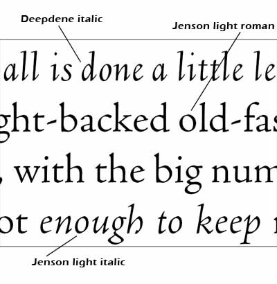
 Goudy’s Deepdene italic, as you can see, is much narrower and more upright than the Jenson italic, but the letterforms are of the same general historic period and they complement the Jenson roman every bit as well as the so-called Jenson italic. It’s also a bit lighter in weight than the standard weight of the Jenson. Fortunately, a light weight is available that is a better match. The two typefaces have a slightly different x-height, so the point size of the italic had to be be cheated a bit, too; but that’s a minor fix.
With modern software, it is easy enough to set up character styles that make the mixing an matching of fonts from different typeface families fairly easy to do. The typographer has to take some care to set this up correctly; but after that, the work goes smoothly.
Details matter. History matters.
occasional essays on working with words and pictures
—writing, editing, typographic design, web design, and publishing—
from the perspective of a guy who has been putting squiggly marks on paper for over five decades and on the computer monitor for over two decades
Saturday, March 01, 2008
Mix and match typefaces
I’ve had a couple of reminders lately of ways the history of type informs design.
The grouping of typefaces into families is a relatively modern notion. When Aldus Manutius introduced the first italic type, in 1501, his purpose was merely to get more words on a page so he could sell his books cheaper than his competitors. Entire books were set in his fonts.
Nowadays, we think of italics as a way to emphasize a word or set off a book title, for example. And we expect the italic face to complement the roman face it is associated with. We think of a typeface family, as a rule, the way we see it used in a word processor: You got yer roman (“normal”), yer italic, yer bold, and yer bold italic. That’s the available spectrum and be darn glad we give you that many choices. If you want more, change the color or add an underscore. Now go away, kid, and don’t bother us.
The other day, on one of the online discussion groups devoted to digital fonts, a fellow pointed out that he has type families consisting of many more than four fonts. A given family might include fonts labeled light, thin, book, medium, semibold, bold, heavy, and black, with both roman and italic fonts in each weight. However, the word processor he was using, Microsoft Word, would not give him access to all those weights. It offered only normal, italic, bold, and bold italic, apparently making its own decisions as to which of the many available fonts was to be mapped to each of those labels. While there is a technical solution that involves opening the font files in a font editor and changing some internal names, that is beside the point. The real solution is to use word processors for word processing and use page layout software for typographic design. Page layout software is not stuck with the four-font paradigm but rather provides access to all the fonts in the typeface family.
The way we got into this fix with word processors gets back to the history of type. The notion of a coordinated set of fonts, with italic and bold faces used for emphasis within a roman text, goes back a couple hundred years. By the time mechanical typesetting was introduced, toward the end of the nineteenth century, this was a fixed idea. The Merganthaler Linotype carried two letterforms on each matrix—typically roman and italic in the book industry and roman and bold in the newspaper industry—which, incidentally, had to have the same width, by definition.
The typewriter, introduced during the same period, was a way of getting letters onto paper without having to pay a compositor to set type by hand or, a bit later, by typesetting machine. But the typewriter was a one-trick pony in terms of font. If you wanted emphasis, your choices were underlining or all caps. The great advantage of the typewriter was cost and efficiency; it was not a typesetting device except in the most rudimentary sense.
But by the late 1960s, the IBM Selectric popularized the notion (introduced earlier by the Varityper, of combining different fonts in a document.
The first word processors were modeled on the typewriter, but when desktop publishing came along (with digital fonts, laser printers, and a wysiwyg user interface), the word processors adapted—somewhat. And here we are today, with normal, italic, bold, and bold italic.
But what brought this topic up was an interesting project I’m working on.
The book is a joint travel diary. The editor of the diary wanted a way to distinguish the two writers typographically. After some experiments with other options, we settled on using roman type for one writer and italic for the other.
But there was a problem. The italic face that “belongs to” the roman we chose is fine for its intended use, but it’s a little too coordinated with the roman to give the idea that these are two people of equal stature. Assigning the roman to the husband and the italic to the wife seemed to subtly suggest a subordinate relationship. The editor and I both thought it important to give her her own distinct typeface.
History to the rescue. The subordinate italic to the roman face (Adobe Jenson) began as an unrelated face in a different century. Knowing that, I decided to select a different italic based on Arrighi’s work, one designed in the first half of the twentieth century by the famous American designer Frederic W. Goudy.
 Goudy’s Deepdene italic, as you can see, is much narrower and more upright than the Jenson italic, but the letterforms are of the same general historic period and they complement the Jenson roman every bit as well as the so-called Jenson italic. It’s also a bit lighter in weight than the standard weight of the Jenson. Fortunately, a light weight is available that is a better match. The two typefaces have a slightly different x-height, so the point size of the italic had to be be cheated a bit, too; but that’s a minor fix.
With modern software, it is easy enough to set up character styles that make the mixing an matching of fonts from different typeface families fairly easy to do. The typographer has to take some care to set this up correctly; but after that, the work goes smoothly.
Details matter. History matters.
Subscribe to:
Post Comments (Atom)
2 comments:
Looks like a smart and handsome solution. I'll have to look into Deepdene; I've heard of but never used it.
When I have projects like this—which I do at least once a year, as I design and typeset an annual journal of oral history interviews—I often choose a type family that includes both serif and sans serif branches. Last year it was Leitura by Dino dos Santos, but in previous issues I've used Quadraat and Scala.
Hi India,
I started out with three test designs. Two used serif and sans to effect the contrast, and the third used roman and italic in one family. The client's gut reaction was that the third sample was a stronger contrast than the first two--even though to my eyes, the contrast between serif and sans was much more obvious.
So it always pays to test your hypothesis with your client. Sometimes our job is to steer the client away from a bad choice; but sometimes our job is to let the client's reaction guide us in our design choices, right?
Post a Comment