Here is a Book Design 101 picture:
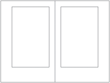 Fig. 1
Figure 1 represents the ideal, classical page. The inner (gutter) margin is the narrowest, with the top margin equal or slightly larger, then the outside margin larger still, and finally the bottom margin largest of all. This is the way we are accustomed to seeing the page. Grab an old hardcover book from your shelf (the older the better), and lay it flat on the table in front of you, open to any page. The spine arches away from the cover so the pages can lay flat, and the pages resemble, to a fair degree, Figure 1.
Now look at a softcover book, a so-called trade paperback—that is, an expensive new book that may never have been issued in hardcover. I’m not referring here to the small mass market paperback you may have picked up at a supermarket or airport, but rather something larger, perhaps six inches by nine inches.
Open it up on the table in front of you. It’s permissible to hold it open with your hands or a weight. It looks something like Figure 2, doesn’t it?
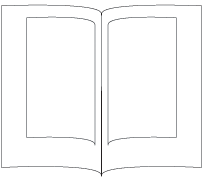 Fig. 2
Because of the way most paperback books are bound (so-called perfect binding), the pages do not lay flat. Instead, they are pinched into the glued spine, and the text block curves into the gutter.
We’re all so used to this, that until someone looks at such a book with fresh eyes, as a client of mine did a couple of days ago, we hardly notice the discomfort in reading the curved text. When books were always issued first in hardcover editions, this design was fine. If the cheapskates who waited for the paperback were somewhat inconvenienced by the narrow gutter, publishers didn’t care.
But today the vast majority of books are issued first as trade paperbacks and are only issued in hardcover after they begin to gain some traction in the marketplace.
So why are we still designing as if the pages are going to lie flat for the reader? Well, because that’s how we designers were trained, for one thing. But let’s rethink this. The basic unit of book design, the two-page spread, sits there in front of us in our page layout software looking very much like Figure 1. But if we think for a moment about the conditions under which readers will encounter the book—something much like Figure 2—we can see that what we
should do is widen the gutter margin substantially, to compensate for what will be lost in the perfectbound gutter.
I propose that Figure 3 should be what we begin with from now on, for books that will be marketed as trade paperbacks. It’s easy enough to generate new output files with the margins in Figure 1 if the publisher decides to issue a hardcover later. There’s no longer a good reason—given the way books are manufactured these days—to use the same book block for both editions. The savings are not sufficient to justify it.
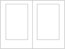 Fig. 3
It may take a while for the people who judge design competitions to catch up, and I don’t suppose publishers will start changing their house styles right away. But I’m going to start down this path and hope others join me. I think it will make books more fun for readers again.
 Fig. 1
 Fig. 2
 Fig. 3
 Fig. 1
 Fig. 2
 Fig. 3
3 comments:
Very good, Dick. This is something I try to take into account when designing. I'm rather surprised--on books for which I'm hired only to do the layout--however, how many publishers commission designs for books with that narrow gutter.
Then again, I remember when paperbacks were an inexpensive alternative to more expensive hard-covers.
I'm not surprised. It's easy to learn in one context (hardcover books) that the narrow gutter is good practice and then forget the underlying principle when you switch to a different context (perfectbound books). It's just an automatic design default that, until someone thwacks you upside the head, you never go back and reconsider.
Great information, Dick. I'm curious what those margins might be for a 6x9 250 page b&w paperback.
I was thinking about top .75", bottom 1", gutter internal 1.25" and outer margin .75"...am I way off or am I not giving enough information to make that assessment?
Thanks for sending me your links.
Post a Comment